LITTLE WINS
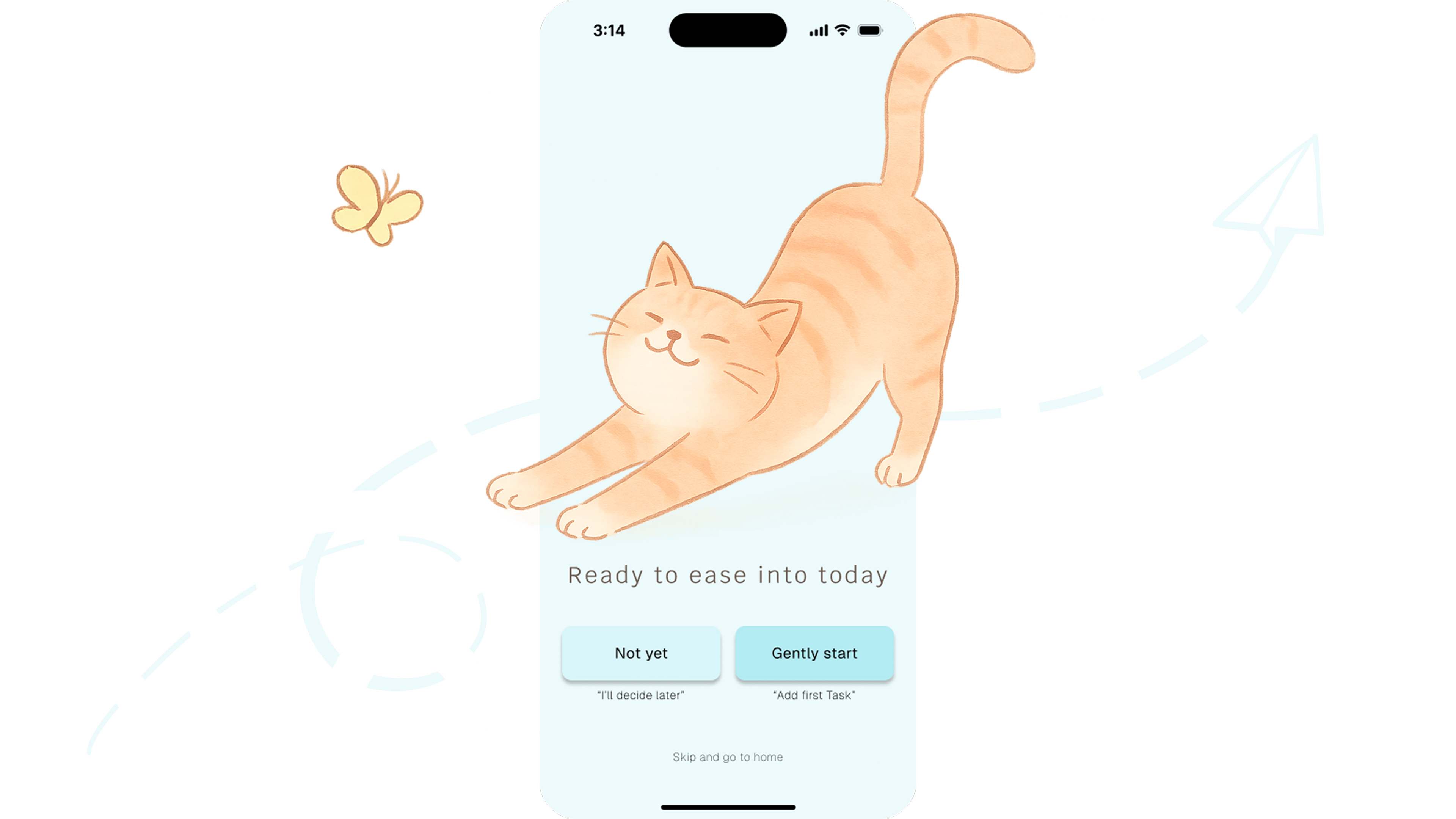
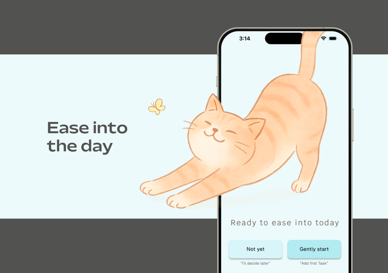
The Problem
Many traditional to-do apps are overloaded with features and harsh reminders,
which can overwhelm users recovering from burnout.
The Goal
evelop a simple, supportive to-do app that helps users rebuild productivity
through little “wins”.
My Role
UX/UI Designer (solo project) – I led the end-to-end design process, from
user research and ideation to wireframing, prototyping, and testing.
The Setup
This project took place during an intensive, week-long UX/UI advanced workshop, with
a total workload of roughly 20 hours on this project.
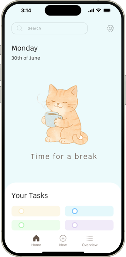
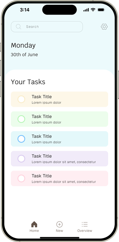
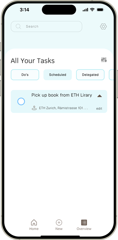
To create an app that truly feels safe and supportive, I first needed to understand the mindset of someone recovering from burnout. I started by empathizing with users’ emotions and daily struggles. At first, I assumed they simply needed a stripped-down task manager. However, research revealed it wasn’t just about fewer features, but about removing the fear and pressure of productivity tools.
To dig deeper into these needs:
Aggressive Reminders:
Add pressure instead of encouragement
Too Many Tasks:
Seeing long lists can feel overwhelming
Cold Interfaces:
Most to-do apps feel transactional, lacking emotional support
Fear of Falling Behind:
Metrics can worsen guilt during slow days
Aggressive Reminders:
Add pressure instead of encouragement
Too Many Tasks:
Seeing long lists can feel overwhelming
Cold Interfaces:
Most to-do apps feel transactional, lacking emotional support
Fear of Falling Behind:
Metrics can worsen guilt during slow days
I created three personas to summarize my findings, and focused on one primary persona named Nina for development.
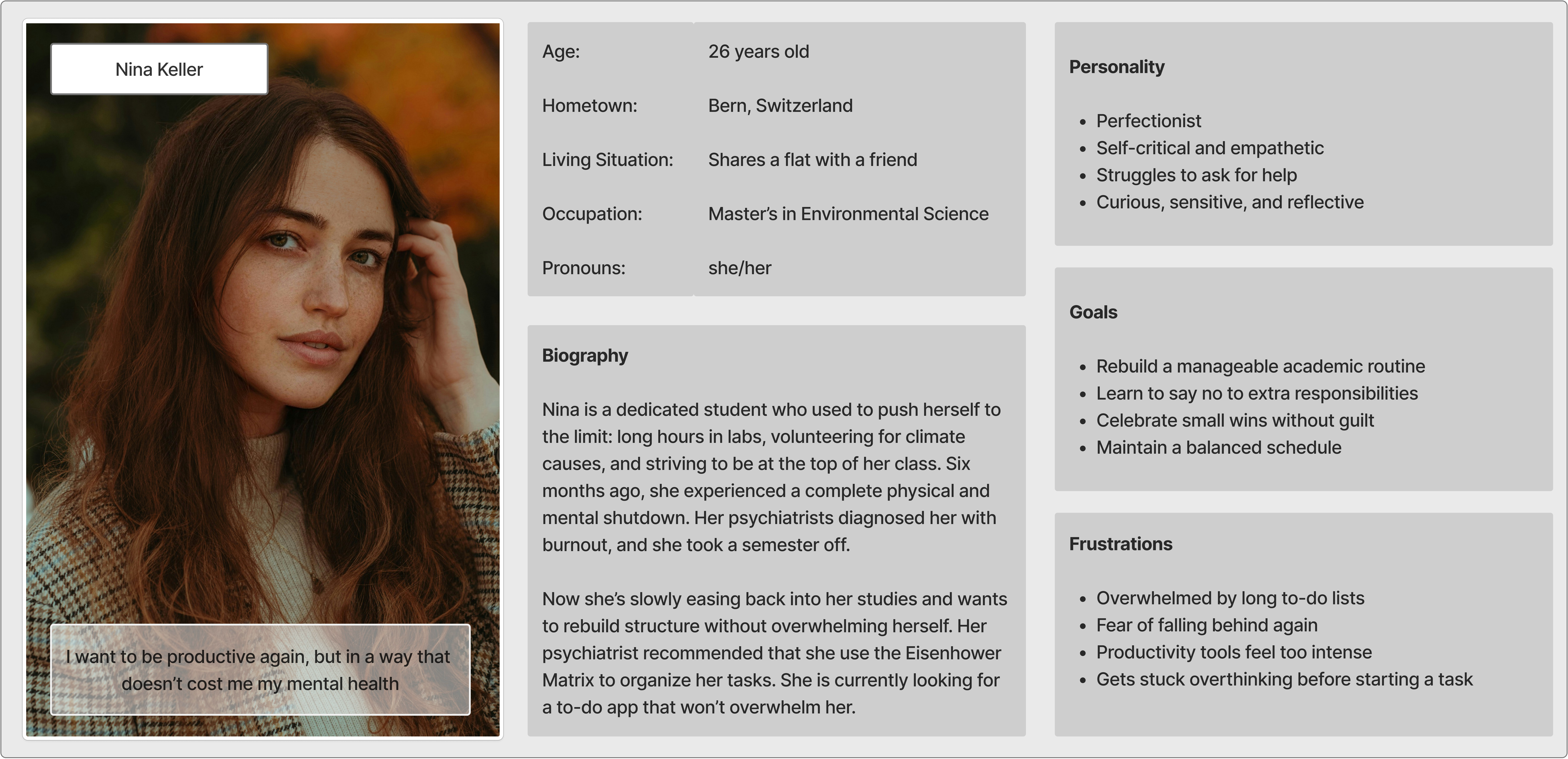
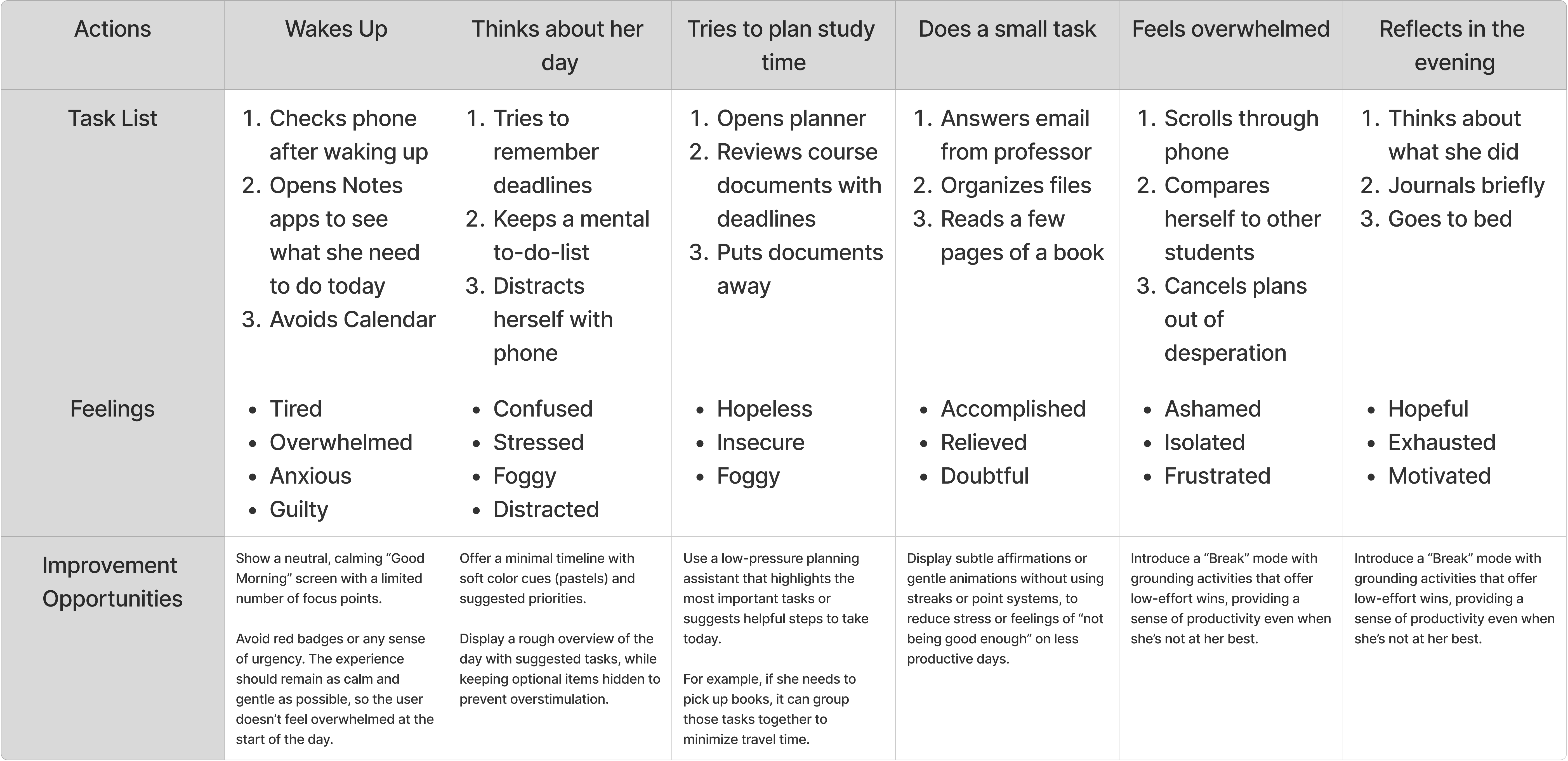
To focus my design efforts, I created user stories, scenarios and storyboards leading to the definition of my Point-of-View (POV) statement.
Nina is a Master's student on leave due to burnout, who needs a way to gently rebuild structure in her life, because she wants to feel in control again.
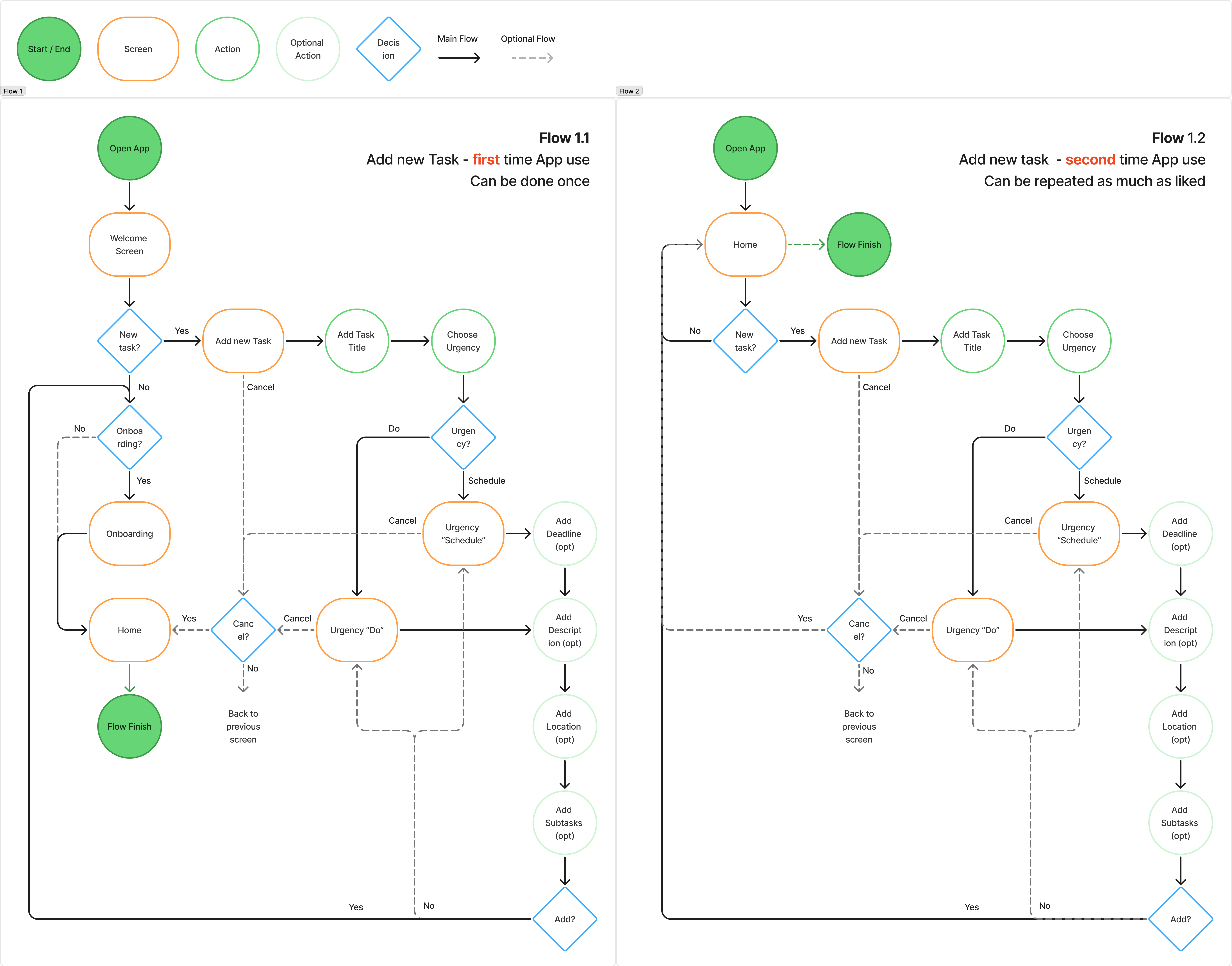
Given Nina’s needs, I aimed for an app experience that was as streamlined and pressure-free as possible. I outlined user stories and basic scenarios, then mapped a simple user flow for the most critical task: creating a new to-do (“Little Win”). This flow would be the heart of the app.
I began the design phase with quick sketches to brainstorm the interface. My initial sketches, admittedly, fell into a common trap: I found myself accidentally adding the very features and metrics I had decided to avoid (old habits die hard!).
I iterated through several layouts focusing on minimalism. Each subsequent sketch I removed an element that felt like it could pressure the user. This subtractive approach ensured the concept stayed true to being light and reassuring.
Moving into wireframing, I translated the chosen sketch ideas into low-fidelity digital wireframes. I focused on the main screens involved in the primary user flow. One standout addition in the wireframes was the location field in the task creation flow. This idea came directly from my interviews – a few people said that including a location made tasks feel more concrete and easier to tackle. I made this field optional and simple.
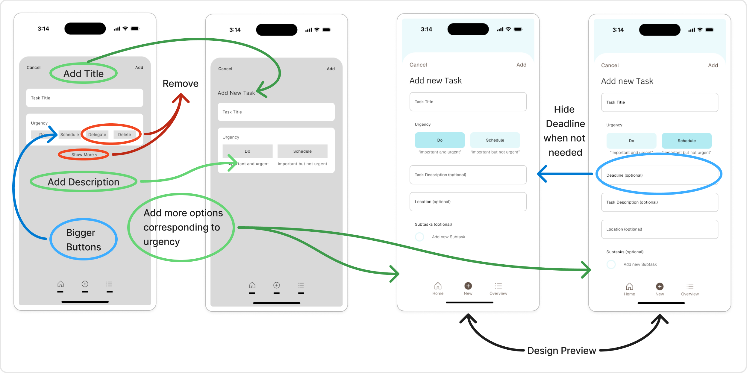
Before diving into high-fidelity design, I conducted usability tests with three users using the wireframe prototype. My goals were to ensure the task flow felt intuitive and to catch any element that might unintentionally create stress. This early testing revealed two important issues:
1) Confusing Task Options
I had incorporated an idea inspired by the Eisenhower Matrix. This turned out to be too
confusing and not very relevant. Test participants weren’t sure what “delegate” or “delete”
meant in context.
2) Layout felt too dense
Users appreciated the clean look but commented that some screens felt a bit cramped.
To address the first issue, I reduced the urgency options to just “do” and “schedule” and removed the "Show More" option. Only when the corresponding urgency is selected, additional fields appear. For example, if you select "schedule", you can then choose a deadline, but not if you select "do".
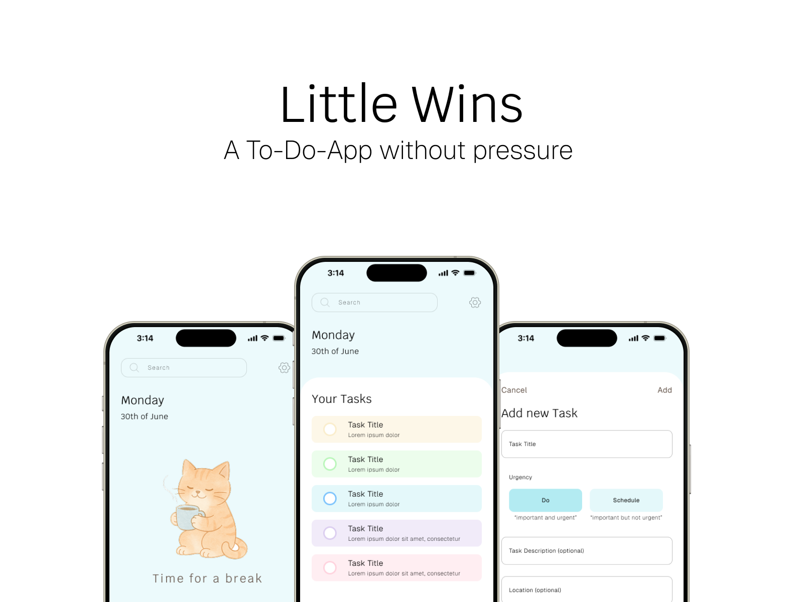
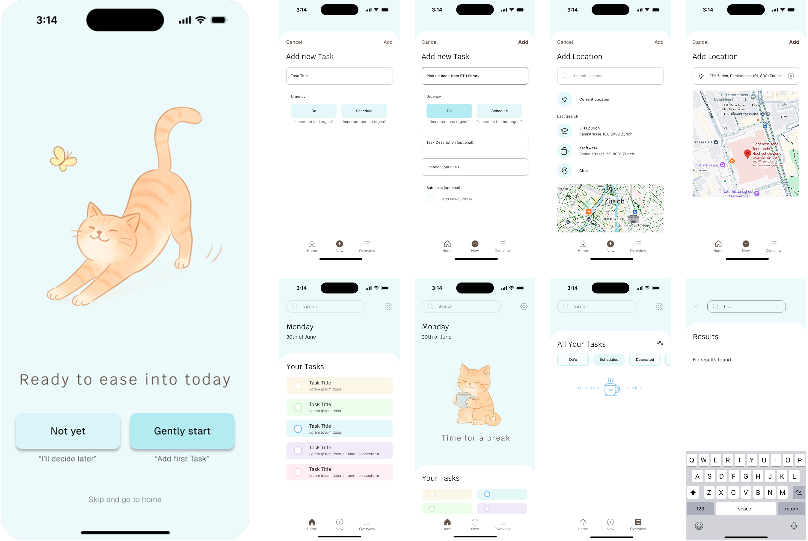
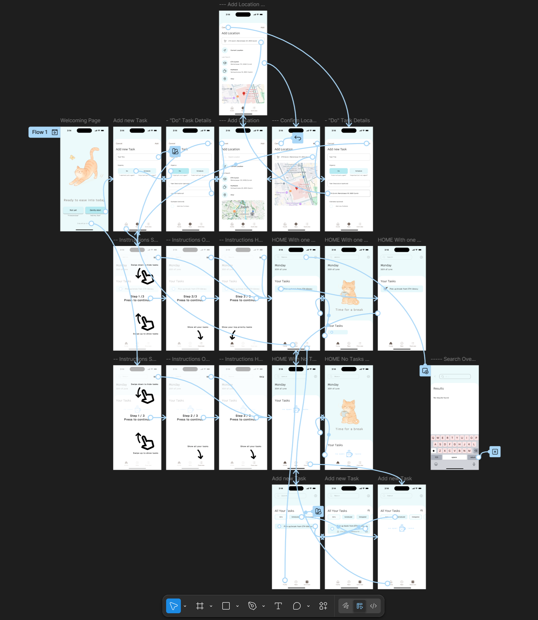
After one week, I was able to create the main user flow for this app. My biggest challenge was balancing a simple yet visually appealing user interface that truly supports my potential users in reaching their goals. Due to time restrictions, I’ve noted several future improvements to explore, that I was not able to implement yet:
Animations:
Implement subtle animations that reinforce a sense of encouragement
Filtering:
Explore ways to filter existing tasks
Personalization:
Allow small personal touches, like choosing colours
Gentle reminders:
Test soft, customizable reminders that help nudge users without pressure
Animations:
Implement subtle animations that reinforce a sense of encouragement
Filtering:
Explore ways to filter existing tasks
Personalization:
Allow small personal touches, like choosing colours
Gentle reminders:
Test soft, customizable reminders that help nudge users without pressure
© 2025 Anthony Zoss. All rights reserved.