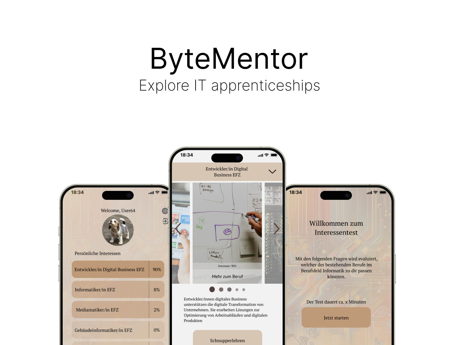
ByteMentor
The Problem
Career paths in IT a dominated by the male gender. This clashes with UN SDG 4.3: Equal
access to education and opportunities.
The Goal
Create an app concept that makes exploring IT apprentiseships simple, engaging, and
inclusive.
My Role
I worked through the full product design process - empathize, define, ideate, prototype
and test - within a group of three.
The Setup
This group project was part of the "Prototyping" Module at the University of Applied
Sciences Grisons. Over one semester we learned UI/UX principles and applied them
directly to this concept.
We started this project by listening. Four young women sat down with us, some already in IT apprenticeships, others still unsure what to choose.
We set out to learn:
At the beginning, we wanted to build an app to address gender gaps in IT apprenticeships. But after talking with our interviewees, we discovered the pain points were not about gender... they were about complex job descriptions and a lack of self-confidence. Because of these insights, we changed the app's course from gender equality to easy exploration and self-testing.
Lack of Clarity:
Job descriptions sound nothing like day-to-day reality
Uncertainty:
“Am I even good enough for this?” was a recurring theme
Scattered Information:
Critical info lives in five tabs, three PDFs, and a guidance counselor’s inbox
Limited Connections:
Few direct ways to meet companies or mentors
Lack of Clarity:
Job descriptions sound nothing like day-to-day reality
Uncertainty:
“Am I good enough for this?” was a recurring theme
Scattered Information:
Critical info lives in five tabs, three PDFs, and a guidance counselor’s inbox
Limited Connections:
Few direct ways to meet companies or mentors
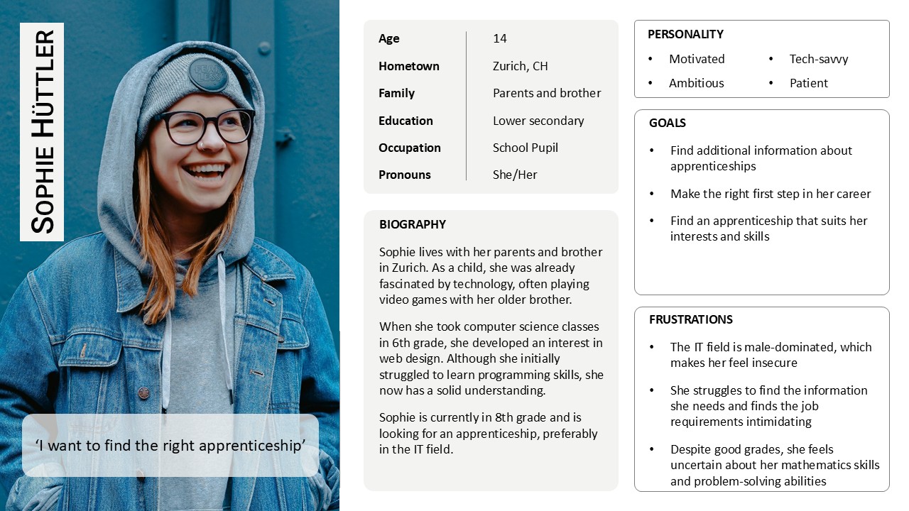
Out of these conversations, Sophie emerged: a composite persona who wants to explore IT but keeps hitting fog, vague job descriptions, intimidating skill lists, and no real human bridge into the field.
On top of that, we created problem and solution scenarios to highlight the challenges, uncertainties, and possible solutions, leading up to the definition of our problem statement.
Sophie is an aspiring apprentice, who needs a clearer understanding of what an IT career actually looks like, because the lack of practical insights makes it difficult for her to make a confident career decision.
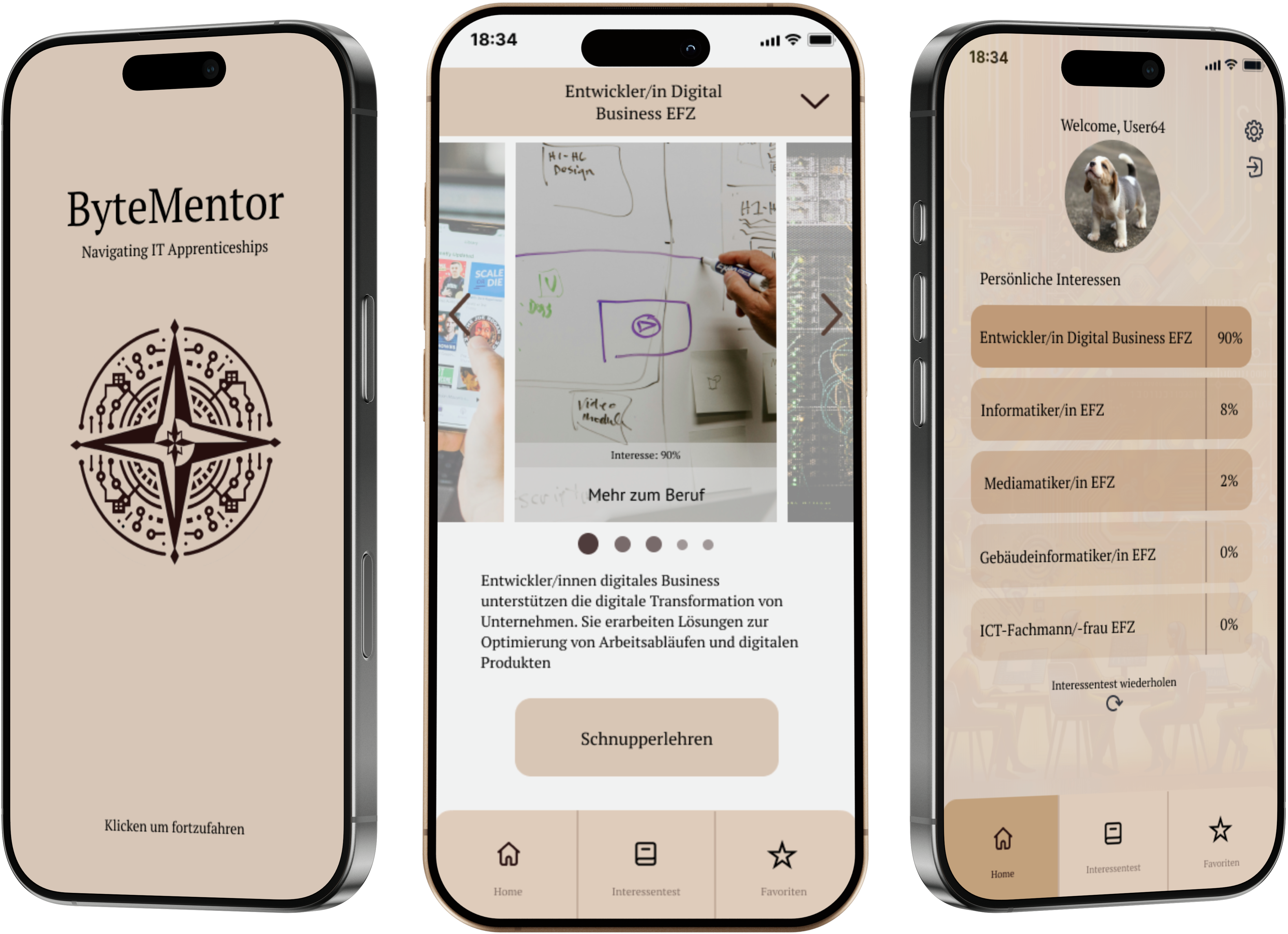
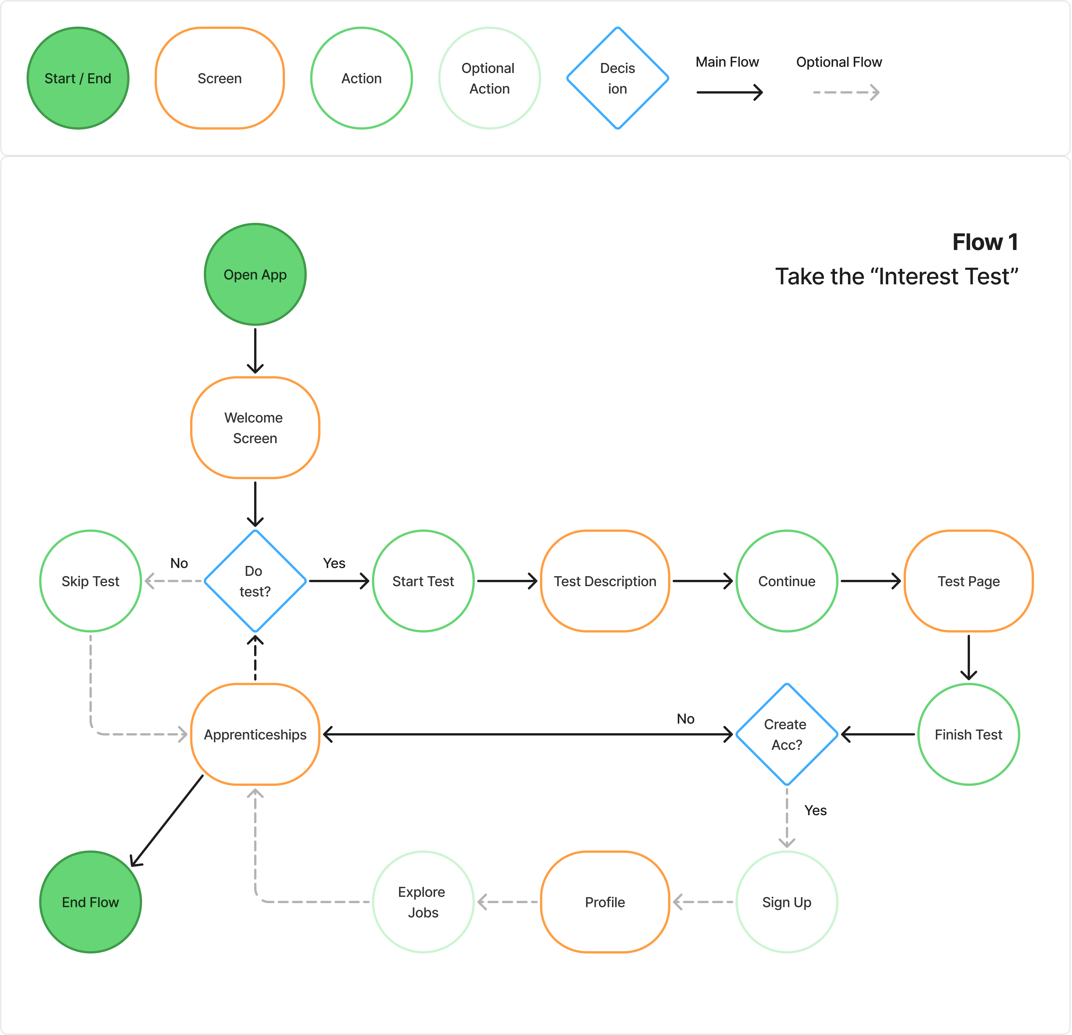
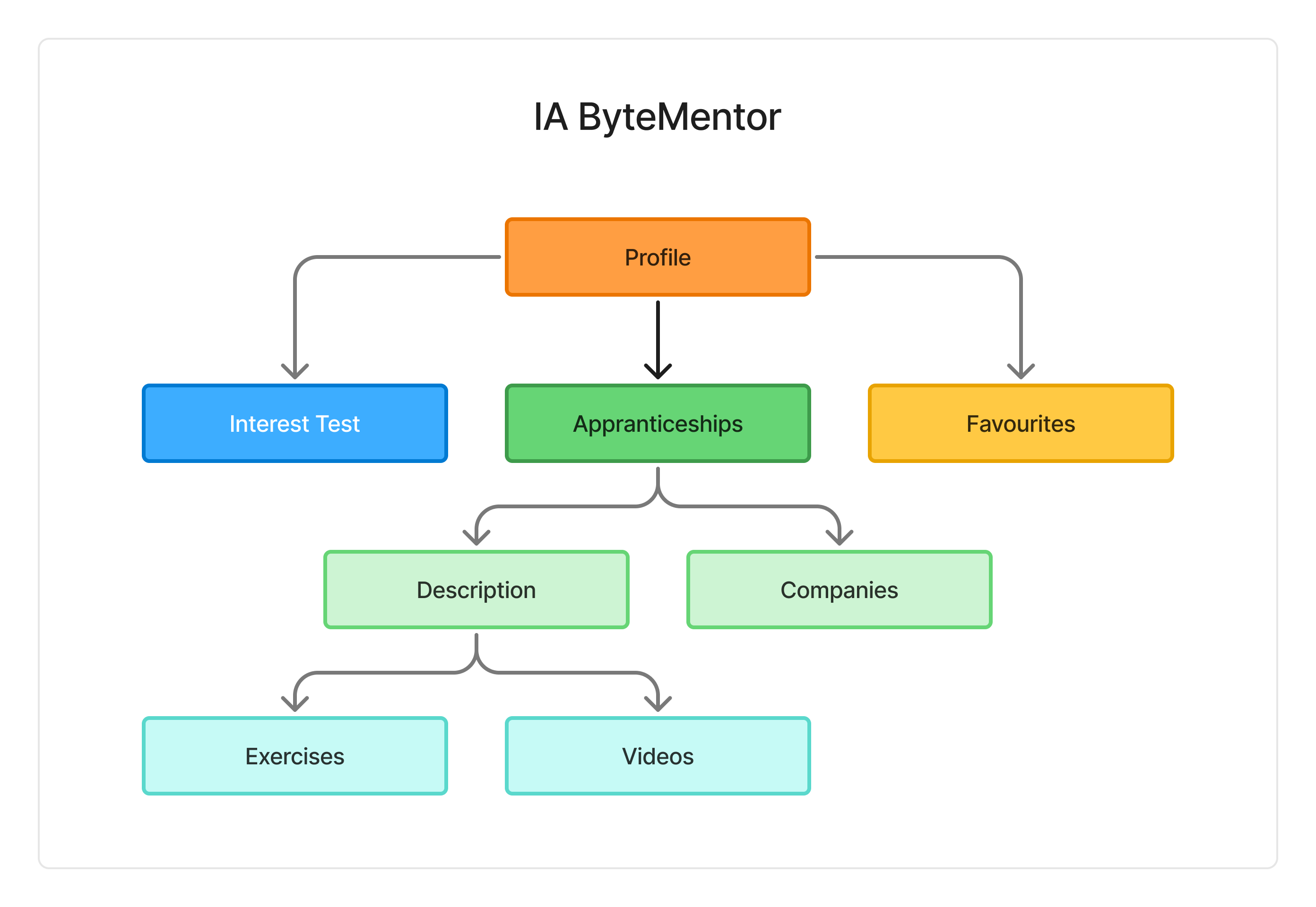
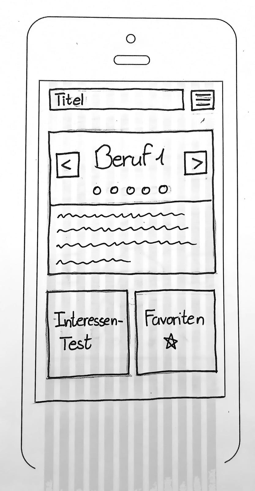
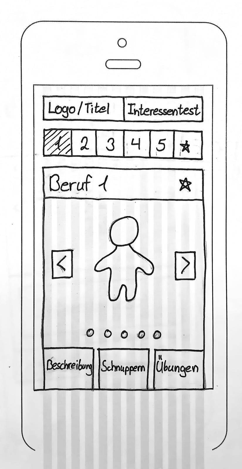
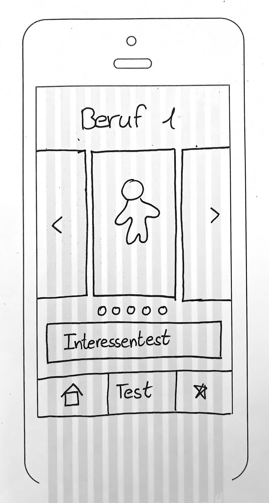
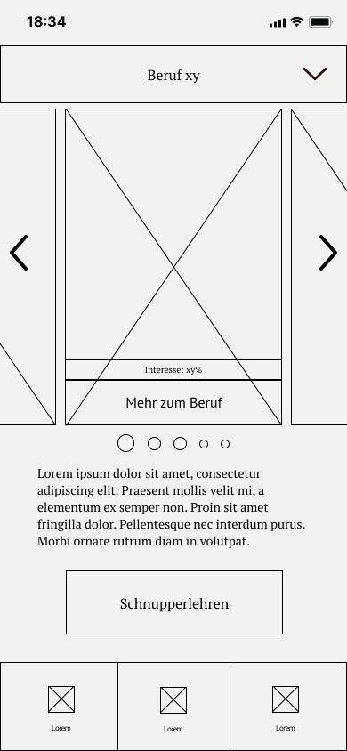
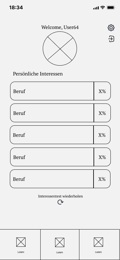
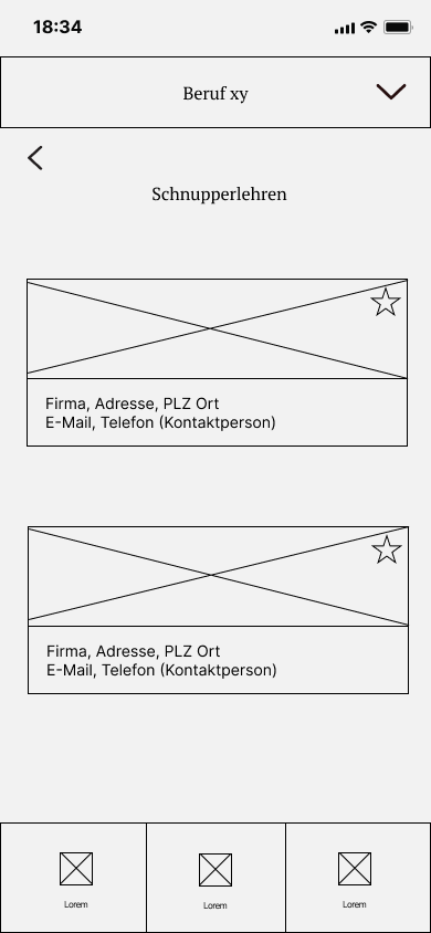
We began with a single flow: take the Interest Text. This quick quiz narrows the endless list of apprenticeships to the few that truly fit, so users don’t drown in options and is a main part of the app
To keep ByteMentor's IA we spread every feature and page onto a wall of sticky notes, then reorganized until the most common questions could be answered in two taps or less. Our priorities:
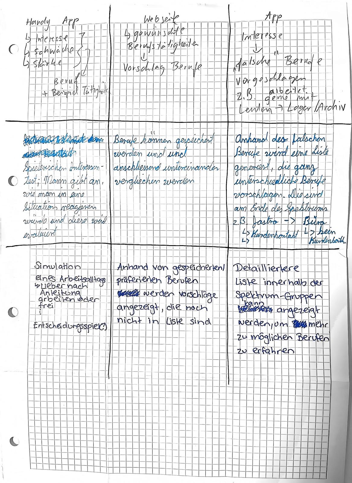
Before we sat down to sketch, we conducted a quick 6-3-5 method: each of us wrote three rough ideas, passed the sheet to the next person, and repeated for five rounds. In thirty minutes we had a stack of evolving concepts. No judging, just building. The best fragments got merged into low‑fi sketches.

For our Usability Test we ran the prototype on a phone in Figma, where six teens could try it out. Two of the six participants had joined our first-round interviews, so we could watch how the design answered their earlier pain.
The test sessions were distributed as followed:
After one semester of hand-on prototyping and lectures on UX/UI principles we created a flesehd out app concept. One of the biggest challenges was squeezing research, design, other module work, and exams into the same calendar while working part-time.
At the end the Usability Tests paid off: they surfaced quick wins (fix the back button) and bigger roadmap items (smarter carousels, clearer favourites). These insights were noted as future improvements:
Fix the back button:
Make sure it always returns to the previous screen.
Tighten the carousel:
Show only images that match the selected profession
Clarify Favourites:
Add a brief tooltip explaining how saved items work
Hide irrelevant results:
Give users a quick way to remove roles that don’t fit their interests
Fix the back button:
Make sure it always returns to the previous screen.
Tighten the carousel:
Show only images that match the selected profession
Clarify Favourites:
Add a brief tooltip explaining how saved items work
Gentle reminders:
Give users a quick way to remove roles that don’t fit their interests
© 2025 Anthony Zoss. All rights reserved.